Dolce Baking Co. was five years old and well-known in the Kansas City area. But owner Erin Brown felt her branding didn’t match up to her baked goods or her vision for the company. A planned move to a larger location nearby provided the perfect opportunity to re-envision what her dream could look like.
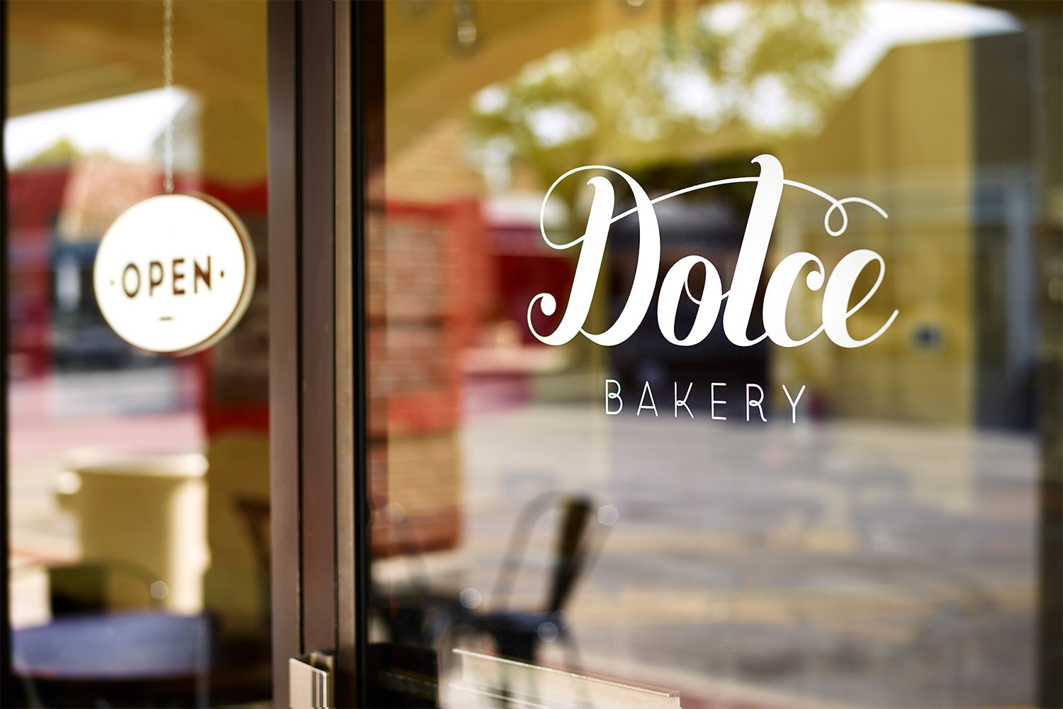
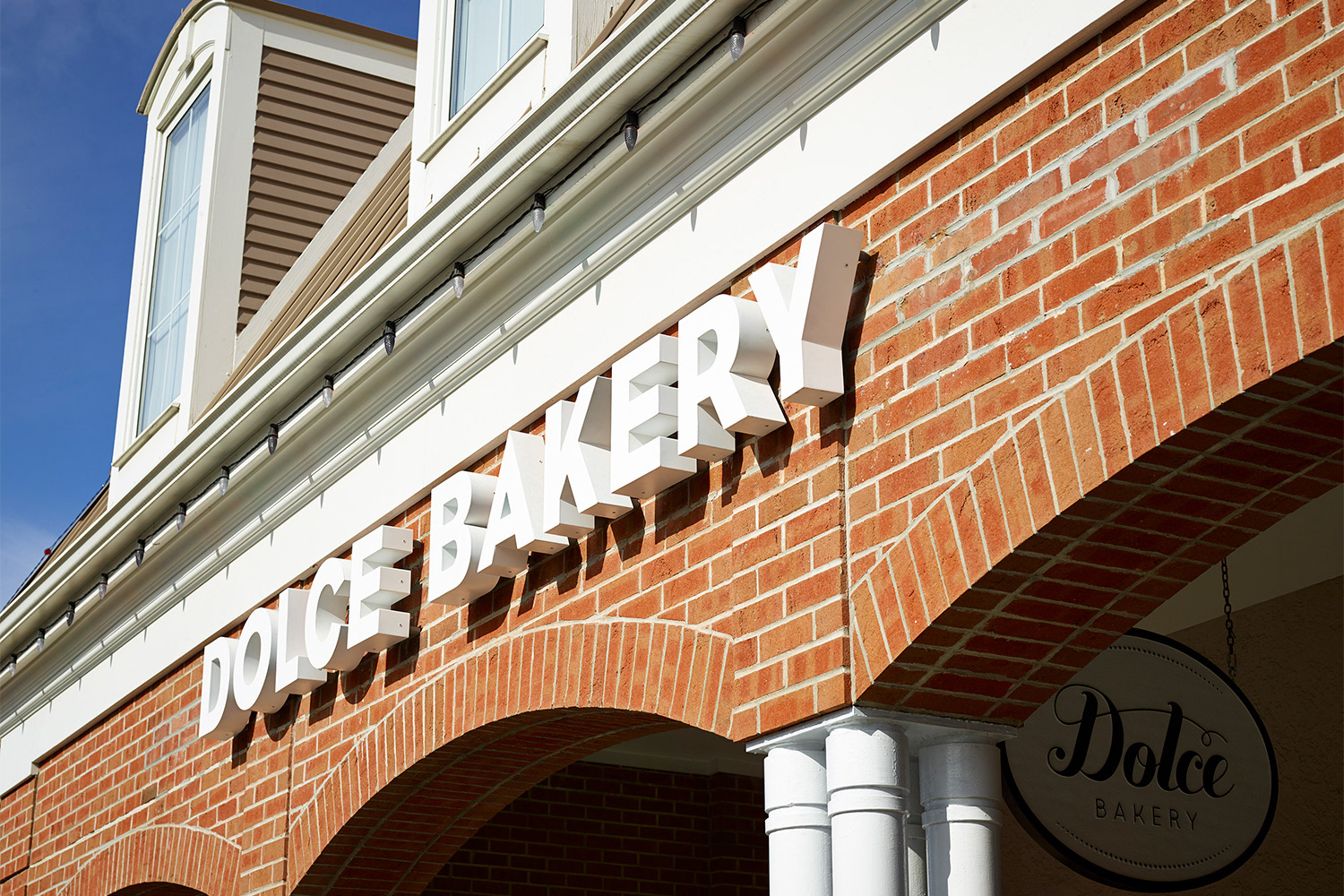
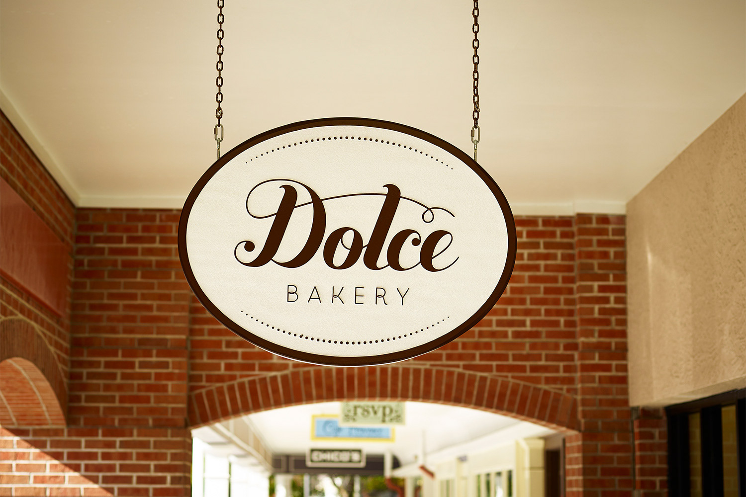
The New Storefront


The Interior Space
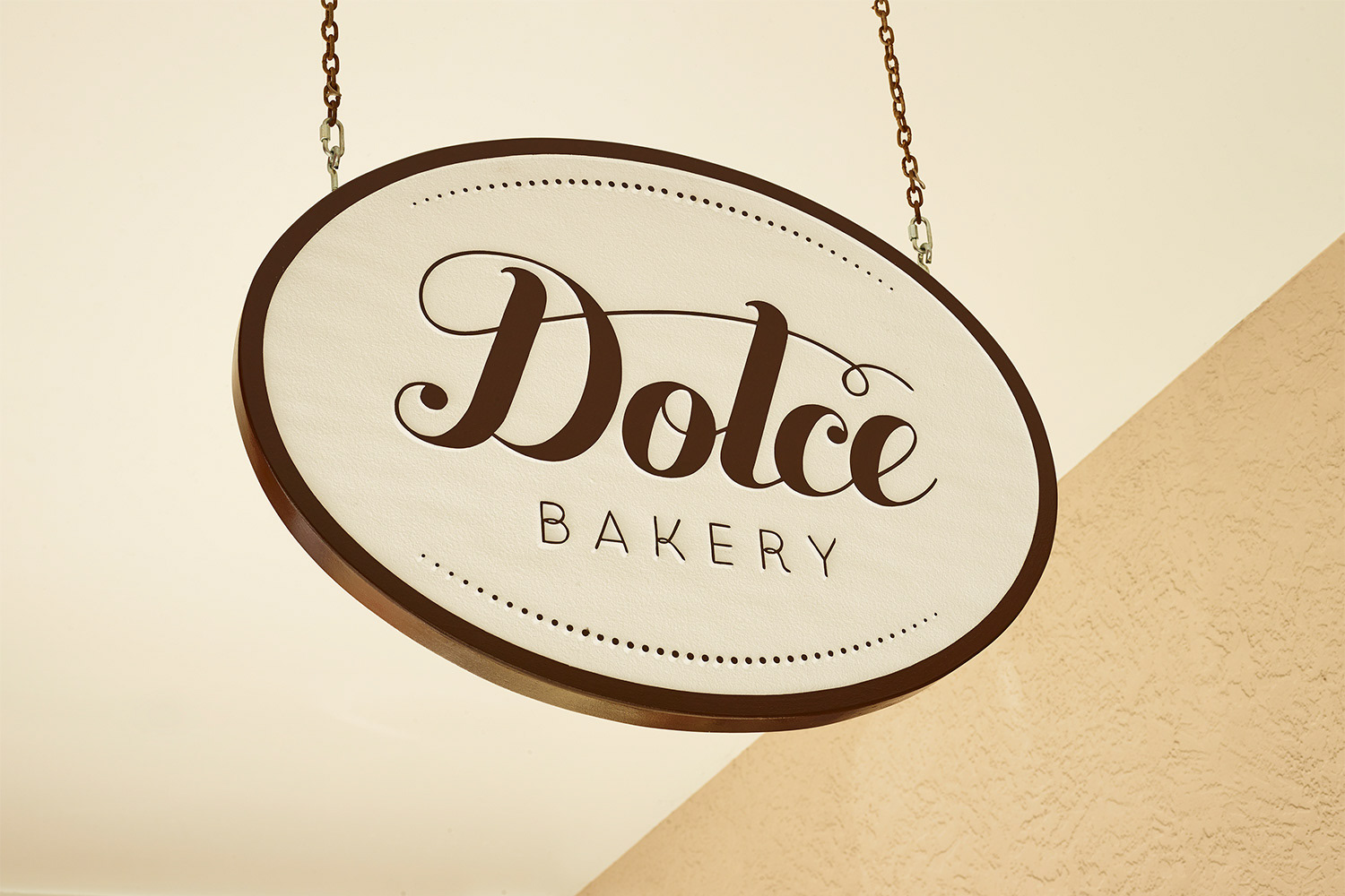
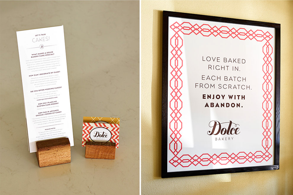
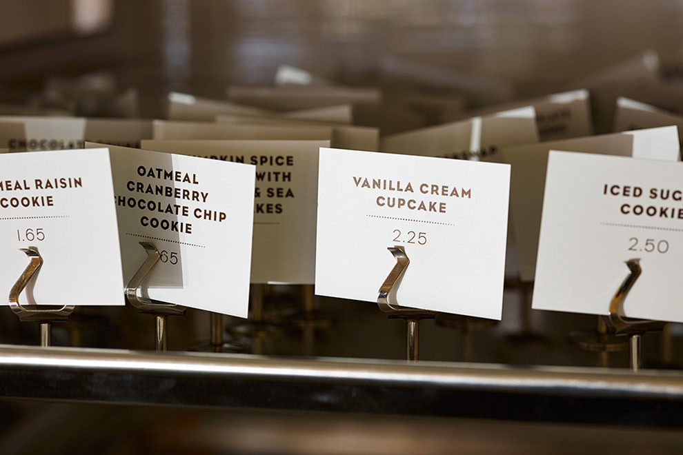
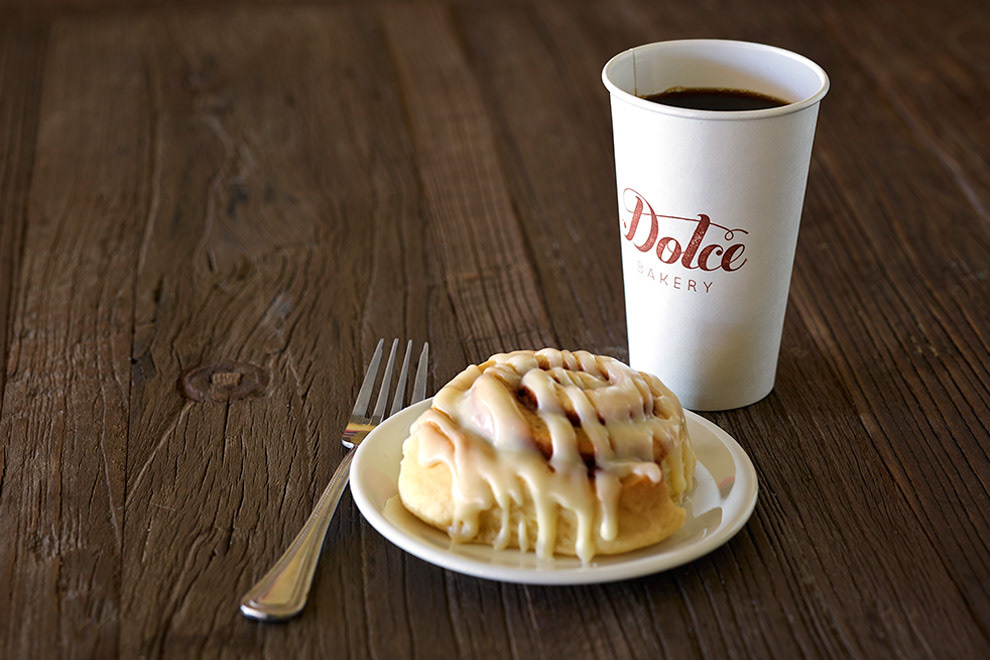
We helped Erin divine the true essence of her business and how to elevate it, particularly in the space itself through environmental elements she hadn’t tried before, like a menu board. The name was tweaked to a more friendly and familiar Dolce Bakery. The new logo, color palette and design arsenal now embody the fine balance of Erin’s philosophy: Signature twists on bakery classics. The copy tone, like Erin and her crew, is friendly, slightly irreverent and indicative of the love for what they do.

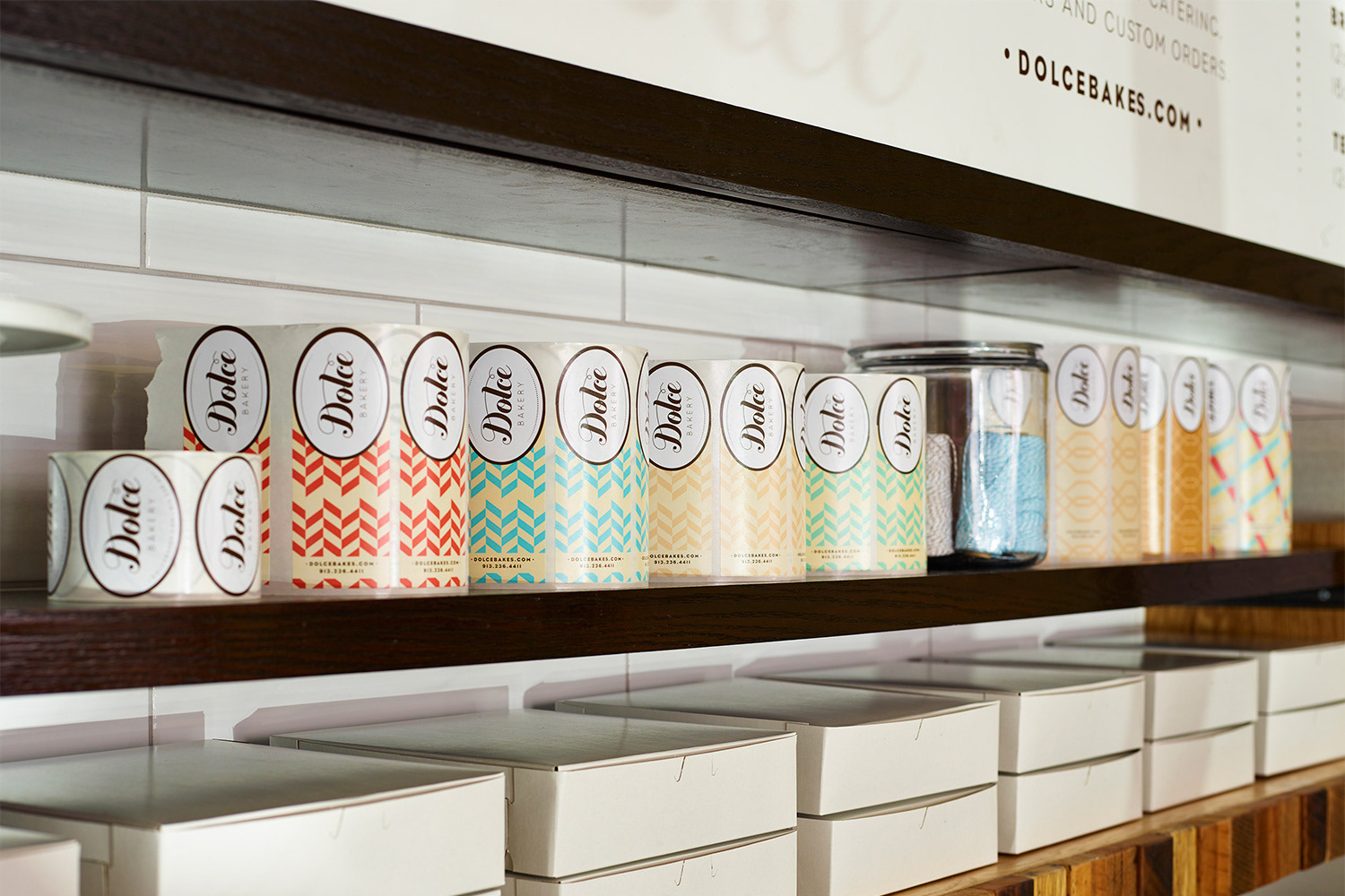
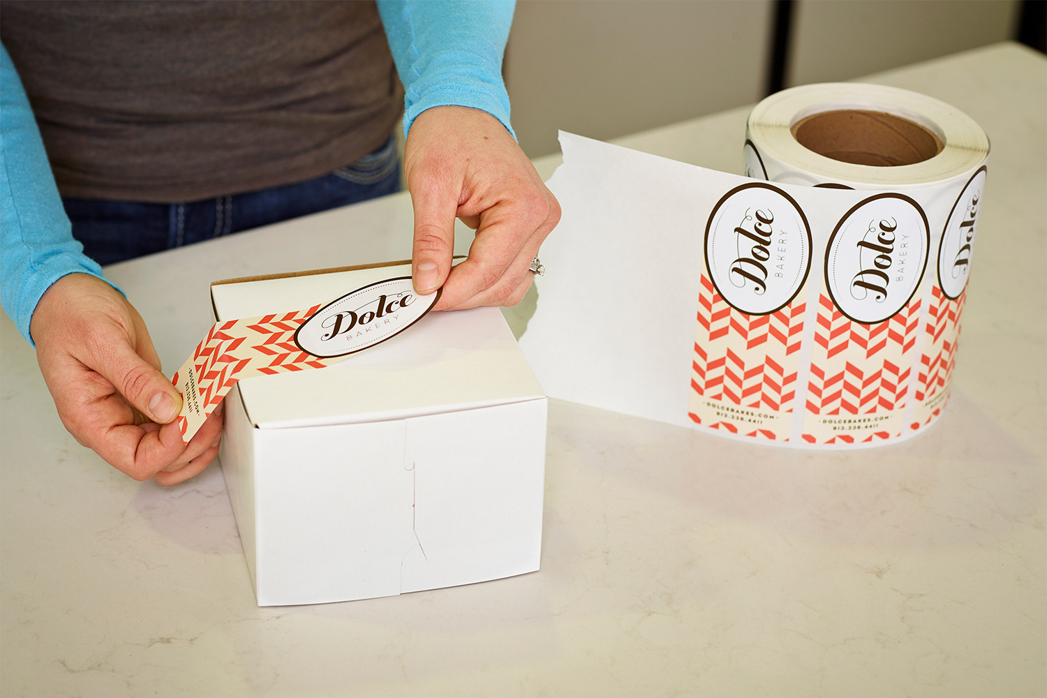
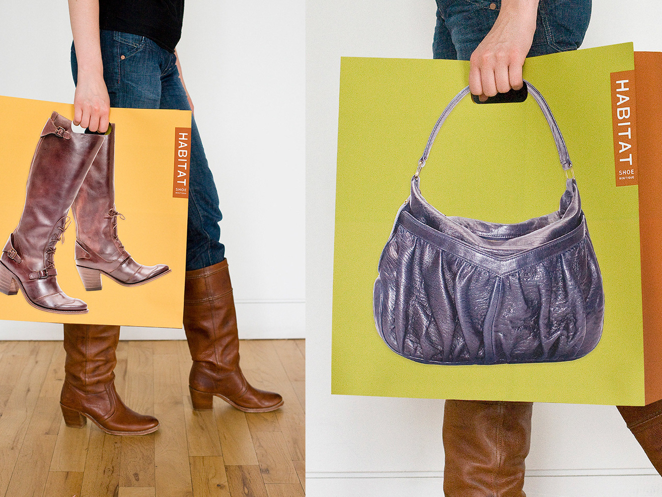
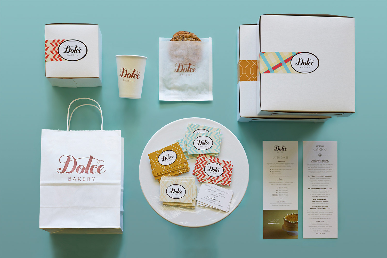
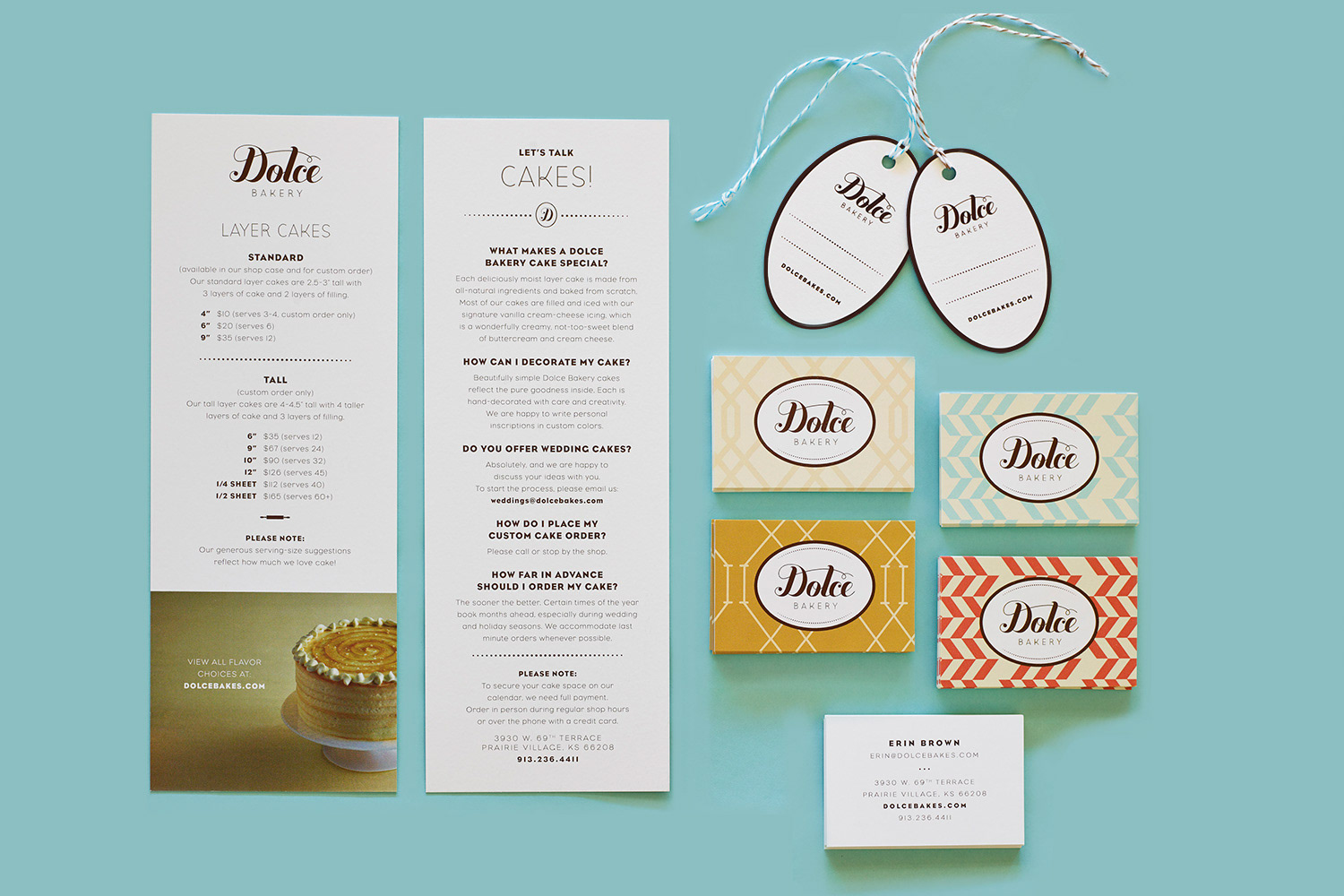
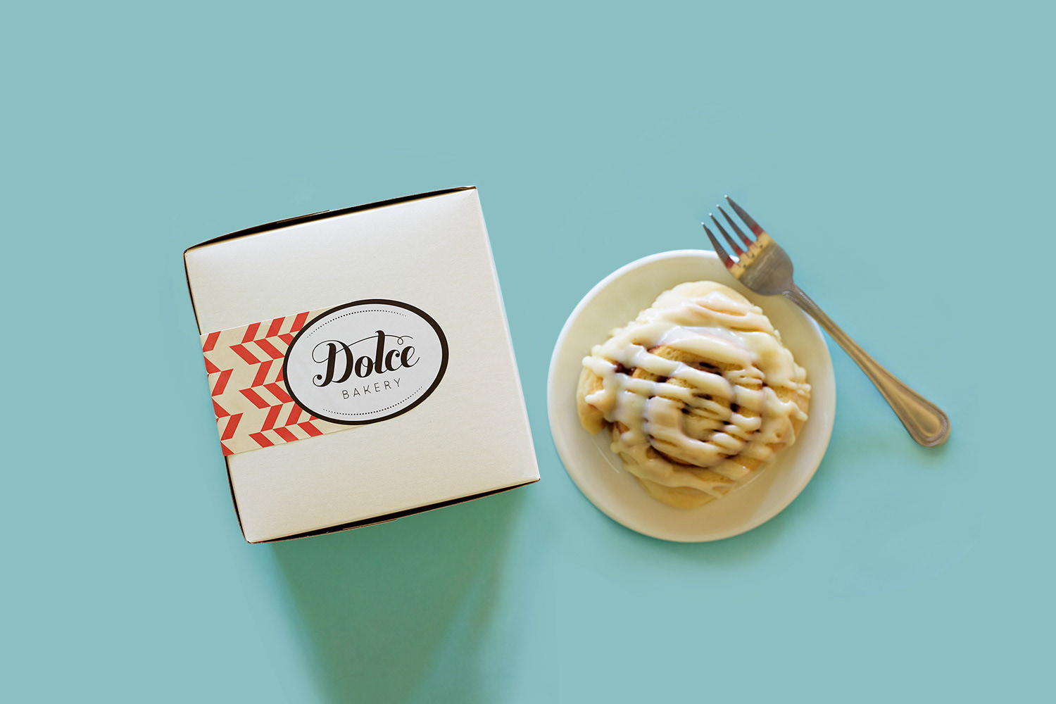
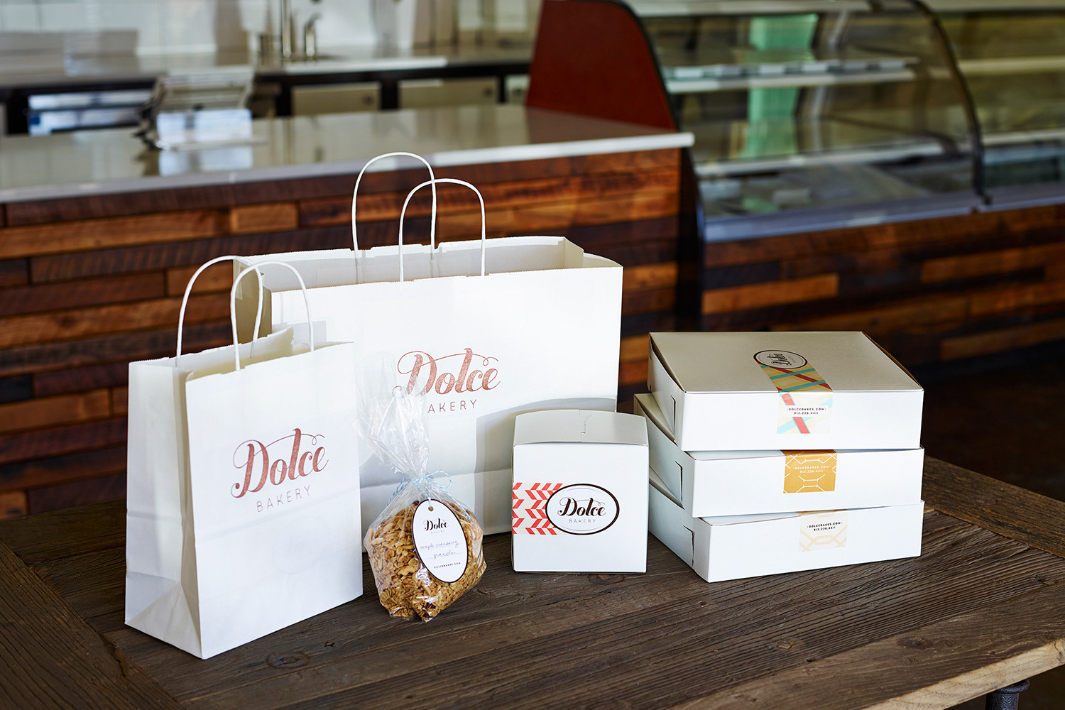
Packaging and Print Materials
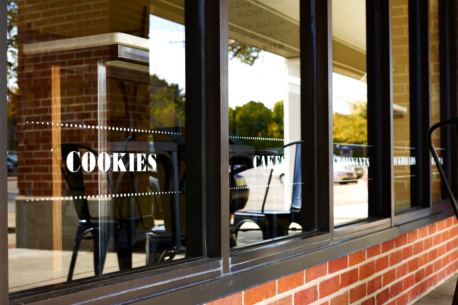
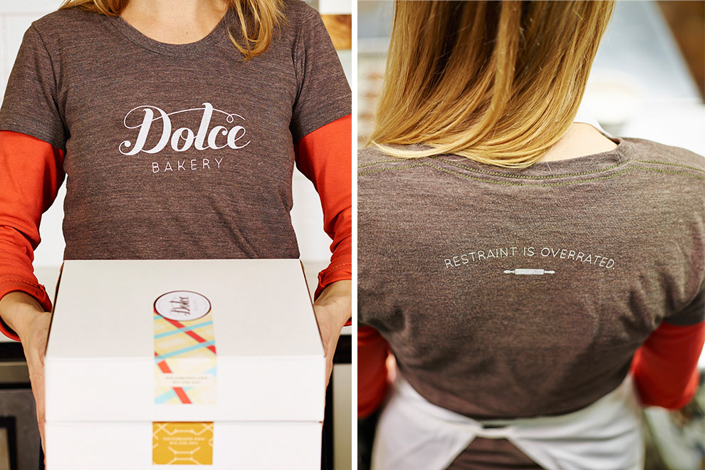
As with so many small businesses trying to grow, the branding budget was limited. So we gave new life to existing packaging materials (like bags and boxes) through rubber stamps, multiple patterns and a vibrant, coordinated set of stickers. Added personality comes through touches like a customizable specials board and window graphics that evoke Parisian cafés while communicating all that’s on offer in the shop.


Website
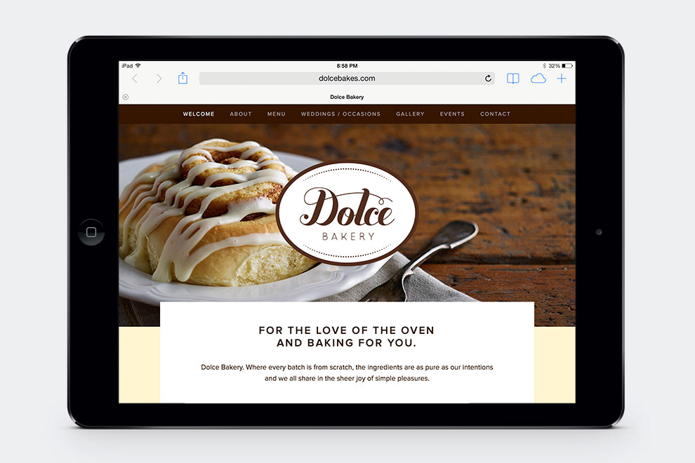
The responsive website (dolcebakes.com) is a reflection of the smart, friendly branding. It’s enticing photography and easy navigation appeal to the customer, while the system is intuitive enough for the Dolce staff to update.


CREDITS
Client: Dolce Bakery
Agency: Stir and Enjoy
Art Director/Designer: Sarah Nelsen
Writer: Brent Anderson
Photographer: Alistair Tutton
Printer: Skylab Letterpress
Client: Dolce Bakery
Agency: Stir and Enjoy
Art Director/Designer: Sarah Nelsen
Writer: Brent Anderson
Photographer: Alistair Tutton
Printer: Skylab Letterpress